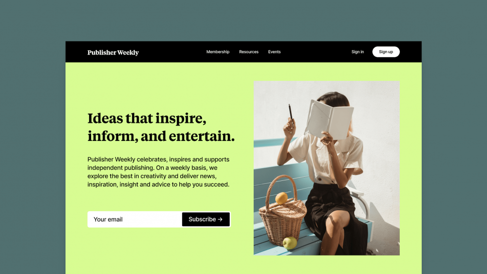
High digital advertising costs and short attention spans make sending potential buyers straight to a shopping cart or checkout page risky. Direct sales pitches often startle cold leads, leading to abandoned carts and wasted marketing spend. This is where a click-through landing page becomes an essential asset for your business.
A click-through landing page serves as a warm, persuasive bridge between your initial promotion—such as a social media ad, a sponsored post, or an email campaign—and your final offer. Instead of asking visitors to pull out their credit card immediately, a click-through page warms them up, educates them on the benefits of your offer, and smoothly guides them to click a single button that takes them to the conversion destination.
Understanding how click-through landing pages work allows creators, solopreneurs, and digital marketers to turn cold traffic into eager buyers without feeling pushy or overly salesy.
What Is a Click-Through Landing Page?
A click-through landing page is a standalone web page designed to educate, inform, and persuade visitors to perform a single action: click through to another page. Unlike traditional web pages, a click-through page does not host a checkout form, nor does it ask for email addresses or contact details right away. Its sole purpose is to prepare the reader to make a purchase decision on the next page.
When visitors land on a click-through page, they are presented with convincing details about a product or service. This includes benefit breakdowns, product demonstrations, customer testimonials, and clear explanations of how the offer solves their specific problems. At the bottom or middle of the page, a prominent call-to-action (CTA) button directs them to the actual sales portal, free trial registration, or order form.
The Psychology Behind the Click-Through Model
The effectiveness of click-through landing pages comes down to a simple psychological principle known as micro-commitments.
Asking a visitor to make an instant buying decision on a crowded checkout page can feel intimidating. They may have questions about your credibility, your return policy, or whether your product actually fits their needs. A click-through page breaks down this decision-making process into smaller, manageable steps:
- Step One: The visitor reads your engaging ad or promotional email and clicks the link to learn more.
- Step Two: They arrive on your click-through landing page, where they absorb useful details, build trust, and see how your product helps them.
- Step Three: They click a button that says “Get Started” or “See Pricing,” making a light mental commitment to proceed.
- Step Four: Having already understood the value proposition, they arrive on the checkout page ready to complete the purchase.
By lowering friction at the start, click-through pages naturally increase the percentage of visitors who complete the final checkout.
Click-Through Landing Pages vs. Other Landing Page Types
To choose the right strategy for your campaigns, it helps to understand how click-through pages differ from other common landing pages.
Click-Through Landing Page
- Primary Goal: Educate visitors and send them to a secondary conversion page or checkout.
- Key Feature: Contains detailed copy, visuals, and a single outbound button instead of form fields.
- Best Used For: E-commerce products, free software trials, high-ticket digital courses, and affiliate marketing offers.
Lead Generation Landing Page (Squeeze Page)
- Primary Goal: Collect user contact details, usually an email address and first name.
- Key Feature: Embedded form fields paired with an offer like a free eBook, webinar, or discount code.
- Best Used For: Building an email list, offering lead magnets, or registering participants for upcoming live events.
Full-Length Sales Page
- Primary Goal: Present the entire sales pitch and collect payments directly on the same page.
- Key Feature: Long-form content featuring extensive sales text, embedded payment forms, and detailed pricing tiers.
- Best Used For: Standalone products, simple digital downloads, or cold traffic campaigns where a multi-step funnel is unnecessary.
When Should You Use a Click-Through Landing Page?
Click-through landing pages excel in situations where your audience needs extra context, warm-up, or reassurance before they feel comfortable making a transaction.
1. Promoting Free Trials for Software and SaaS
If you offer a software product, asking users to fill out complex account details right off the bat can cause high drop-off rates. A click-through page lets you highlight core features, display dashboard screenshots, show user reviews, and answer FAQs. Once visitors see the real value, clicking “Start Free Trial” feels like a natural next step.
2. E-Commerce Product Showcases
When launching a flagship item or running a flash sale, sending paid traffic directly to a basic product listing can result in high bounce rates. A dedicated click-through page allows you to tell the story behind the product, showcase video demonstrations, display customer reviews, and emphasize special promotions before guiding shoppers to the cart page.
3. Digital Products and Online Courses
Creators selling eBooks, templates, or online training programs often need space to explain what is included in the package. A click-through page provides room to outline the curriculum, introduce the instructor, highlight transformational outcomes, and build authority. Readers can then click through to a secure order page once they are convinced of the value. For more strategies on setting up effective sales funnels, check out our guide on building a landing page that converts for digital products.
4. Affiliate Marketing Offers
If you promote products as an affiliate marketer, sending traffic directly to the merchant’s home page often yields poor results because the audience lacks context. A pre-sell click-through page allows you to review the product, share personal experiences or case studies, and explain why you recommend it. Once readers are convinced, clicking your affiliate link transfers them to the merchant site, primed to complete the purchase.
Core Components of a High-Converting Click-Through Landing Page
Creating a successful click-through landing page requires combining clear communication, strategic structure, and persuasive writing. Every element on the page should serve a single purpose: guiding the visitor toward that final click.
A Strong Message-Matched Headline
Your headline is the first thing a visitor reads, and it determines whether they stay on the page or click away. It must instantly reassure visitors that they are in the right place by matching the tone, message, and promise of the ad or email that brought them there. If your ad promises “5 Simple Steps to Organize Your Finances,” your landing page headline should mirror that core promise directly.
Clear, Problem-Solving Body Copy
Keep your writing focused on outcomes rather than just listing features. Explain clearly how your product addresses your target audience’s specific challenges and how their life or business will improve after using it. Use short paragraphs, clear section breaks, and simple bullet points to keep the content easy to read and scan.
Engaging Visuals and Proof
High-quality imagery, short product walkthrough videos, and crisp screenshots give visitors a concrete sense of what you offer. Seeing a product in action removes uncertainty and makes your offer feel real and trustworthy.
Social Proof and Trust Identifiers
People tend to look to others before making buying decisions. Adding genuine customer testimonials, star ratings, user stats, or client logos builds instant credibility. When visitors see that others have had a positive experience, their hesitation disappears.

Take Your Emails to the Next Level
MailDrip helps you automate your outreach, nurture leads, and grow your brand with ease. Send the right message at the right time—without the stress.
Sign Up FreeNo Card Required
A Single, Clear Call-To-Action (CTA) Button
A click-through landing page should feature one primary action. Avoid adding navigation links, social sharing buttons, or alternative offers that could pull visitors away. Your CTA button should stand out visually with contrasting colors and clear, action-driven copy, such as:
- “Claim Your 14-Day Free Trial”
- “See Available Course Modules”
- “Explore the Full Collection”
- “Get Started Today”
How to Create a Click-Through Landing Page That Converts
Building an effective landing page does not require a web development background or complex software stacks. Following a clear, step-by-step framework helps you launch high-performing pages quickly.
Step 1: Clarify the Goal of the Next Page
Before writing a single word, identify the exact destination of your CTA button. Are you sending visitors to a Stripe checkout page, a calendar booking form, or a product details portal? Knowing the final destination helps you write copy that seamlessly prepares the reader for what happens next.
Step 2: Write for a Single Reader
Tailor your language directly to your ideal customer. Speak in simple, friendly, everyday English, using “you” and “your” to make the reader feel like you are speaking directly to them. Focus on addressing their primary concern, answering their most likely objection, and showing how your product provides a reliable solution.
Step 3: Remove All Page Navigations and Distractions
One of the biggest mistakes creators make is using standard website pages—complete with top menu bars, footers, and sidebars—as landing pages. Header menus give visitors easy excuses to leave before reading your message. Remove top navigation links, search bars, and external footer links to keep attention focused strictly on your content.
Step 4: Ensure Mobile Responsiveness and Fast Loading Speed
A large percentage of your audience will view your landing page on a mobile device. If your page takes more than three seconds to load or features misaligned buttons on small screens, visitors will leave immediately. Keep image sizes optimized, use clean page layouts, and test your page on multiple devices before launching your campaign. You can explore additional layout ideas in our article on 9 practical landing page tips for increased conversion.
Step 5: Connect Your Page to Your Email Marketing Workflows
Click-through landing pages work best when paired with strategic email communications. When potential customers sign up or click through your landing pages, following up with automated email sequences helps nurture their interest and gently guides them toward completing their purchase.
If you want a simple way to combine email marketing and landing pages without managing multiple complicated platforms, MailDrip offers built-in tools designed specifically for creators, digital marketers, and growing businesses.
With MailDrip, you do not even need a pre-existing website to launch effective campaigns. You can create landing pages and opt-in forms directly from your dashboard, set up automated drip sequences to nurture your leads, and connect your existing Gmail or business email accounts seamlessly. Learn more by reviewing our full MailDrip features page or checking out our transparent MailDrip pricing.
Common Mistakes That Ruin Click-Through Page Conversions
Avoid these common pitfalls to ensure your landing pages perform at their absolute best:
- Message Mismatch: If your ad promises a 20% discount on an eBook, but your landing page headline focuses on a coaching program, visitors feel misled and leave immediately. Ensure your ad text, landing page copy, and final offer align seamlessly.
- Adding Too Many Choices: Presenting multiple competing offers or asking visitors to choose between several different buttons creates decision fatigue. Stick to one clear CTA button throughout the page.
- Overwhelming Walls of Text: Long, dense blocks of text tire readers out quickly. Keep paragraphs short, use bold headers for readability, and use lists to make key takeaways easy to digest.
- Hiding the Call-To-Action: Do not force readers to scroll all the way to the bottom of a long page just to find your CTA button. Place a primary button near the top section (above the fold) and repeat it naturally after key sections.
Frequently Asked Questions (FAQs)
What is a good click-through rate for a landing page?
Click-through rates vary depending on your industry and traffic source. Warm traffic coming from your email newsletter often achieves click-through rates of 20% to 40%, while cold traffic from social media ads typically sees click-through rates between 5% and 15%. Focus on clear headline messaging and fast page speeds to stay on the higher end of these benchmarks.
Do I need a full website to use a click-through landing page?
No. You do not need a full multi-page website to run effective click-through campaigns. Many creators and digital marketers use standalone landing page builders or simple email marketing platforms to create dedicated offer pages without managing a complex WordPress or custom web setup. For a simple step-by-step breakdown, read our guide on how to build a landing page without a website.
Should I include pricing details on a click-through page?
It depends on your offer. If you are selling an affordable product or running a flash sale, presenting price details on your click-through page helps filter out unqualified traffic so only serious buyers click through to checkout. However, if you are selling a high-ticket service or offering a free trial, focusing on benefits first and introducing price details on the final checkout page often leads to better overall conversions.
How does email marketing work together with click-through pages?
Email marketing and click-through landing pages form a powerful combination. You can send targeted promotional broadcasts or automated nurture sequences to your subscribers that link directly to a dedicated click-through landing page. The email introduces the idea, the landing page elaborates on the value, and the checkout page closes the sale. To learn how to structure these sequences, visit our breakdown on email automation workflows.
Simple Email Marketing and Landing Pages Made for You
Creating high-converting click-through landing pages and automated email follow-ups does not have to be complicated, technical, or expensive.
At MailDrip, we believe you should not have to pay for complex tools you will never use. We built MailDrip specifically for creators, solopreneurs, and small business owners who want simple, reliable marketing tools that drive revenue without the technical headaches.
Whether you are launching your first digital product, selling online courses, or running automated email sequences, MailDrip gives you landing pages, opt-in forms, and straightforward email drip campaigns right out of the box. You can start sending emails for free with our flexible plans or use our Pay-As-You-Go option so you only pay for what you actually send.
Ready to see how simple email marketing and landing page creation can be? Head over to our main page at MailDrip, explore our educational guides on the MailDrip blog, or dive straight into your MailDrip dashboard today to build your next campaign.
What is the biggest challenge holding you back from creating your next landing page today?