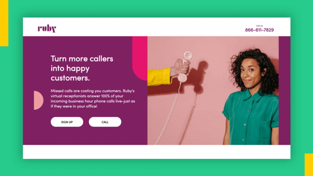
When a visitor arrives on your webpage, you have roughly three seconds to capture their attention before they hit the back button. That split-second decision happens entirely inside one specific area of your webpage: the hero section.
The hero section is the very first thing people see when they visit your website or landing page without scrolling down. It acts as your digital front door, your elevator pitch, and your primary invitation all rolled into one.
If your hero section is confusing, cluttered, or boring, visitors leave. If it is clear, engaging, and focused on solving a real problem, visitors stay, read, and convert.
Understanding how to build a clear, effective hero section matters more today than ever before. With online audiences constantly surrounded by notifications and endless content, clarity is your biggest advantage.
Let us look closely at what makes a hero section work, how to build one step by step, and how to turn casual visitors into loyal subscribers or buyers.
What Exactly Is a Hero Section?
In web design and digital marketing, the term “hero section” comes from the print advertising era, where the main visual or lead story on a newspaper front page was called the “hero.” In digital spaces, the hero section refers to the top screen area of a webpage, often described as “above the fold.”
“Above the fold” is a term originally used by newspapers to describe the top half of the front page—the news you could see when the paper was folded on a newsstand. Online, it refers to everything visible on a browser or phone screen before the user begins scrolling down.
The primary goal of a hero section is not to tell your entire life story or list every product feature you offer. Its job is far simpler:
- Tell visitors where they are.
- Explain what you can do for them.
- Show them what exact step to take next.
When these three elements align, your page immediately builds trust and directs user action without causing confusion.
Why the Hero Section Dictates Your Conversion Rates
First impressions online happen in milliseconds. Research shows that web visitors form an opinion about a page’s credibility and relevance almost instantly. If your hero section fails to communicate value immediately, no amount of brilliant copy hidden further down the page will save your conversion rate.
The top area of your page carries immense weight for several key reasons:
- It reduces cognitive friction: People do not want to guess what a business does. A well-designed hero section gives instant clarity so visitors do not have to work hard to understand your offer.
- It filters your audience: A great hero section clearly communicates who your product or service is for. This attracts your target audience while letting non-ideal prospects move along, improving your overall conversion quality.
- It sets the trajectory for user action: Whether you want visitors to join a newsletter, buy a digital product, or sign up for a demo, the call to action in your hero section directs visitor behavior right from the moment they land.
The 5 Essential Components of a High-Converting Hero Section
A successful hero section relies on a balanced combination of strategic copywriting and clean visual structure. You do not need complex animations or bloated graphics. Instead, focus on these five core components.
1. The Main Headline Your headline is the single most important sentence on your entire landing page. It should be bold, easy to read, and centered around the primary benefit your audience receives. Avoid clever or vague phrases that sound nice but mean nothing. Focus on utility and outcome.
For example, instead of writing “Innovative Solutions for Digital Pioneers,” write “Grow Your Email List on Autopilot Without Tech Stress.” The second option tells the visitor exactly what benefit they will receive.
2. The Supporting Subheadline While the main headline grabs attention, the subheadline provides context. In two or three short sentences, your subheadline expands on the promise made in the headline. It explains how you deliver that promise and addresses any immediate objections or questions the reader might have.
3. The Primary Call to Action (CTA) The CTA is the action button or opt-in form that tells visitors what to do next. It might say “Get Started Free,” “Download the Playbook,” or “Join the Newsletter.”
A great CTA button stands out visually against the background color, uses clear, action-oriented text, and requires minimal effort from the user. If you are collecting email addresses, asking for just a first name and email address will yield far higher conversion rates than requesting a full address, phone number, and company size.
4. The Visual Anchor Human eyes naturally process visual information much faster than text. The visual element in your hero section should complement your headline, not distract from it.
Depending on what you offer, your visual anchor might be:
- A clean mockup of your digital product or software dashboard.
- A high-quality photo of you working with clients.
- A short visual demonstration of your product in action.
- A simple graphic illustration that reinforces your core message.
5. Trust Signals and Micro-Social Proof Adding small trust indicators near your headline or CTA button helps lower hesitation. This micro-social proof can be as simple as:
- A short star rating or review count (e.g., “Loved by over 2,000 creators”).
- Logos of recognized platforms or publications you have been featured in.
- A brief note reassuring users that their data is safe and they can unsubscribe anytime.
Step-by-Step: How to Write Copy for Your Hero Section
Writing copy for a hero section can feel intimidating because every word carries significant weight. Here is a practical, step-by-step formula you can follow to write hero copy that connects with your readers.

Take Your Emails to the Next Level
MailDrip helps you automate your outreach, nurture leads, and grow your brand with ease. Send the right message at the right time—without the stress.
Sign Up FreeNo Card Required
Step 1: Identify your audience’s main pain point
What frustrates your reader before they find your offer? Are they struggling to find clients, overwhelmed by complex software, or looking for a way to monetize their audience?
Step 2: Define the desired outcome
What does success look like for them once their problem is solved? Focus on feelings of relief, saved time, increased revenue, or ease of use.
Step 3: Combine problem and outcome into a clear headline
State the direct result clearly. State what the user gets and what pain they avoid.
Step 4: Use the subheadline to explain your mechanism
Mention how your product, service, or newsletter achieves that result. Keep it simple and direct.
Step 5: Write action-focused CTA button copy
Focus on what the user gets when they click, rather than just using a generic word like “Submit.” Use phrases like “Claim Your Free Guide,” “Start Building Today,” or “Get Instant Access.”
Real-World Copy Breakdown
If you are a creator selling a digital guide on email marketing, your hero copy structure might look like this:
- Headline: Master Email Marketing Without Spending Hours on Complex Software.
- Subheadline: Learn how to write simple drip campaigns, build your audience, and generate consistent revenue with our beginner-friendly playbook.
- CTA Button: Get My Free Guide Now.
- Trust Signal: Joined by 1,500+ independent creators.
Design Principles for Clean, Distraction-Free Hero Sections
Even the best copywriting will fail if the visual design feels confusing or cluttered. You do not need to be a professional web designer to build a high-converting hero section. Following a few basic layout principles will keep your page clean and focused:
- Maintain strong visual hierarchy: Make your headline visibly larger than your subheadline, and make your CTA button pop. Guide the viewer’s eyes naturally from top to bottom.
- Embrace generous white space: Give your text and images room to breathe. Crowding elements together makes a page feel overwhelming and harder to scan.
- Keep text contrast high: Ensure text is dark enough to read easily against light backgrounds, or bright enough against dark backgrounds. Never sacrifice readability for aesthetic experiments.
- Design for mobile screens first: A massive percentage of your web visitors will view your page on a smartphone. Your hero section must stack neatly on smaller screens so that your headline, visual, and CTA button remain visible without endless scrolling.
Common Hero Section Mistakes That Drain Your Conversions
When landing pages underperform, the issue almost always traces back to a few avoidable mistakes in the top section:
- Trying to say everything at once: A hero section with three different headlines, four offer buttons, and multiple competing images confuses readers. Stick to one core message and one primary call to action.
- Using vague corporate jargon: Phrases like “synergistic ecosystem solutions” or “next-generation paradigms” do not convey value. Use plain, friendly language that speaks directly to your reader’s daily experience.
- Hiding the Call to Action: Forcing a visitor to scroll down before seeing a button or sign-up form creates unnecessary friction. Keep your main CTA visible immediately.
- Slow loading graphics: Large, uncompressed image files or heavy videos slow down your page loading speed. If your hero section takes longer than a couple of seconds to render, visitors will leave before seeing your offer.
Frequently Asked Questions
How long should a hero section headline be?
Keep your headline concise—ideally between 6 to 12 words. It should be short enough to read in a single glance while clearly stating the core benefit.
Should I use a video or an image in my hero section?
Both work well depending on your offer. Images load faster and are great for showing digital products or personal brand headshots. Short videos work well if your product requires a quick visual demonstration, but ensure the file size is optimized so it does not slow down your page.
Can I have more than one CTA button in the hero section?
It is best to focus on one primary action. If you must include a second button (such as “Learn More” alongside “Sign Up”), give it a secondary visual style, such as an outline style, so it does not compete with your main goal.
Does every page on my website need a hero section?
Your home page, standalone landing pages, and sales pages should always have a strong hero section. Secondary informational pages like privacy policies or contact pages can use simpler headers.
How do I know if my hero section is working?
Track your page conversion rate—the percentage of visitors who click your CTA or submit their email address. If your conversion rate is below average, test changing your headline clarity or making your CTA button text more specific.
Your landing page hero section is your best opportunity to make a great first impression, clearly communicate your value, and invite your audience to take action. By keeping your headline clear, your design uncluttered, and your call to action direct, you can turn casual visitors into active subscribers and customers.
If you want an easy, stress-free way to capture leads and send automated emails, explore MailDrip’s features or view our simple pricing plans. You can start with our free plan or pay as you go, giving you total control over your growth.
Take a look at your current website or landing page hero section today: Does it clearly tell a new visitor what you can do for them in under three seconds?
Creating Landing Pages and Hero Sections Without Tech Stress
For many creators, solopreneurs, and digital marketers, the hardest part of building a landing page isn’t deciding what to say—it’s dealing with complicated website builders, server setups, and clunky software integrations.
You do not need a massive budget or a degree in web development to launch high-converting landing pages. Tools designed with simplicity in mind allow you to capture leads, share your message, and grow your audience without technical friction.
This is where MailDrip makes a difference. Instead of forcing you to connect external forms to separate email platforms, MailDrip provides simple, built-in landing pages and opt-in forms right out of the box. You can design clean, distraction-free hero sections that immediately capture reader interest and collect subscriber details without building a full website.
Whether you want to launch a newsletter, promote a digital download, or build an automated lead funnel, you can set up your page, customize your form, and connect automated email sequences directly from your dashboard. Check out our guide on how to create a landing page that converts for digital products or learn how to launch your page even if you do not have a website yet.
When your landing page hero section connects seamlessly to automated drip sequences, every new lead instantly receives your welcome email or freebie while you focus on creating great content.