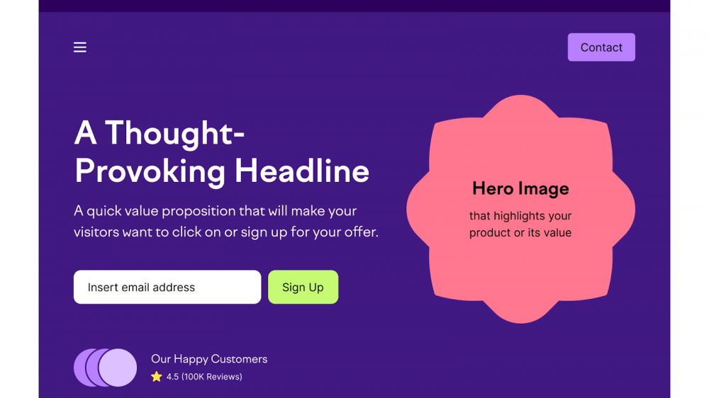
Think of a landing page like a physical store. If the front entrance is blocked, the signs are confusing, and the checkout counter is hidden in a back room, shoppers will simply walk out.
In digital marketing, that layout and underlying flow is called landing page architecture. It is the framework that guides a visitor from the moment they click your link to the moment they take action, like signing up for your newsletter or buying your product.
When your landing page architecture works, everything feels natural. Visitors understand what you offer, why it matters, and what to do next. But when the architecture breaks, your results drop fast, even if you are sending plenty of traffic to the page.
Fixing your page layout is often the single quickest way to turn quiet traffic into steady email subscribers and sales. Here are eight clear signs that your landing page architecture needs a rethink, along with simple steps to fix it.
What Is Landing Page Architecture?
Before reviewing the warning signs, it helps to understand what landing page architecture actually means.
Landing page architecture is not just about choosing pretty colors or picking nice fonts. It is the structural backbone of your page. It includes:
- Visual flow: How a reader’s eye moves from the top headline down through your offer.
- Information grouping: How you organize benefits, features, social proof, and FAQs into logical sections.
- Technical structure: How fast the page loads, how forms talk to your email tool, and how clean the backend setup is.
- Path to conversion: How easy it is for someone to fill out a box and click a button without getting stuck.
When these elements fit together smoothly, your page converts. When they are thrown together without a clear plan, your visitors get confused and click away.
8 Signs Your Landing Page Architecture Needs a Redesign
1. Your Conversion Rate Is Dropping (Even with Good Traffic)
If you are running social media posts, sending emails, or buying ads, you expect a reasonable percentage of visitors to take action. When traffic stays steady or grows, but your actual email signups or sales drop, your page architecture is usually leaking leads.
What is happening: Visitors arrive with interest, but the structural layout fails to guide them to the finish line. They skim the top section, lose interest in the middle, and leave before taking action.
How to fix it: Review your page structure from top to bottom. Simplify the hero section so your core promise is immediately clear. If you want a step-by-step look at rebuilding your layout for better results, check out these 9 practical landing page tips.
2. The Page Loads Slowly and Feels Cluttered
Page speed and clean structure go hand in hand. Heavy page layouts packed with oversized images, complex scripts, and unnecessary visual elements take too long to open.
What is happening: Most people will not wait more than two or three seconds for a web page to open. If your page architecture is weighted down by extra code and massive files, mobile users will hit the back button before they even read your headline.
How to fix it: Strip away the noise. Remove heavy background elements, unnecessary pop-ups, and complex layout widgets. A clean, focused layout loads quickly and keeps visitor attention right where you want it.
3. Your Call to Action (CTA) Gets Lost in the Noise
Your Call to Action is the most important element on the entire page. It is the button or form that turns a visitor into a subscriber or buyer. If your page architecture buries this element, your results will suffer.
What is happening: Common CTA layout mistakes include:
- Placing the main button too far down the page where nobody sees it.
- Using multiple competing buttons that ask for different things (for example, “Buy Now”, “Read Our Blog”, and “Follow Us”).
- Making the button color blend into the background.
How to fix it: Give your page one primary goal. Place a prominent action button high up where visitors can see it without scrolling. Use high-contrast colors so the button stands out immediately. You can read more about selecting effective button designs in this guide on CTA color and design strategies.
4. Mobile Visitors Leave Almost Instantly
Over half of all web traffic comes from mobile phones. If your landing page architecture was built only with a desktop computer screen in mind, mobile visitors will have a frustrating experience.
What is happening: On small screens, poor layout choices show up as overlapping text, buttons that are too small to tap with a thumb, and forms that zoom in awkwardly or break entirely.
How to fix it: Build with a mobile-first mindset. Ensure every section stacks logically on phone screens, text size remains comfortable to read, and forms fit naturally within small viewports.
5. Your Content Hierarchy Is Disorganized
Good page architecture leads the reader on a clear logical journey: Problem → Solution → Benefits → Social Proof → Call to Action. When this hierarchy gets mixed up, visitors get confused.
What is happening: A disorganized layout might display client reviews before explaining what the product actually does, or present a massive block of bullet points before stating the main benefit of the offer.
How to fix it: Organize your information into scannable blocks using clear headings. Use bold text for key takeaways, keep paragraphs short, and present elements in a sequence that builds trust step by step.
6. Your Lead Forms Are Complex or Broken
The architecture of your opt-in form determines how effortlessly visitors can give you their details. Every extra field you ask someone to fill out creates extra effort and hesitation.
What is happening: Asking for a full name, phone number, company size, and job title on a simple free newsletter page discourages signups. Worse yet, if the form fails to connect directly with your email service, subscribers get lost in translation.

Take Your Emails to the Next Level
MailDrip helps you automate your outreach, nurture leads, and grow your brand with ease. Send the right message at the right time—without the stress.
Sign Up FreeNo Card Required
How to fix it: Keep your form design minimal. On most lead capture pages, an email box and a single submit button are all you need. Ensure your form connects smoothly to an automated email system so every new lead instantly receives a welcome email.
7. There Is a Disconnect Between Your Traffic Source and the Page Header
When a user clicks a link in your social media post, advertisement, or email, they expect the landing page to match the exact message that caught their interest.
What is happening: If your post promotes a free checklist, but your landing page header broadly talks about your general consulting services, visitors get confused. They feel like they landed on the wrong page and leave immediately.
How to fix it: Align your headline and main section directly with your source traffic. If you are promoting a specific event, such as a live workshop, ensure your layout is built specifically around that promise. You can see how focused layouts work by checking out dedicated webinar landing pages.
8. You Need a Developer Every Time You Want to Change Simple Text
A modern landing page structure should give you complete freedom to make quick updates. If changing a headline, updating a price, or swapping an image requires hiring a developer or fighting with code, your setup is holding your business back.
What is happening: Clunky custom builds and overly complicated web software slow down your marketing. When testing a small headline change takes days instead of minutes, you stop testing altogether, and your business growth stalls.
How to fix it: Switch to a simple page tool that lets you build, edit, and publish clean opt-in pages in minutes without technical friction.
How a Simple Landing Page Fix Boosts Your Business
Redesigning your landing page architecture sounds like a big project, but it does not have to be overwhelming. You do not need to spend huge sums of money on agencies or spend weeks learning complicated tools.
In fact, the best landing pages are often the simplest ones. They focus on clear writing, fast loading times, and a painless signup process.
Key Insight: When you remove technical clutter and focus on clean layout design, your visitors can easily see the value of what you offer. That simple shift directly improves your conversion rates and helps grow your subscriber list faster.
If you are building an audience or selling digital products, having simple, built-in landing page tools makes everything easier. That is where a straightforward platform like MailDrip fits in naturally.
Building Simple, High-Converting Pages with MailDrip
At MailDrip, we believe you do not need more feature bloat—you just need tools that work cleanly and reliably. Born out of Yaba, Lagos, MailDrip was created specifically for creators, solopreneurs, digital marketers, and personal brands who want to connect with their audience without technical headaches.
You do not even need an existing website to start collecting leads or launching campaigns. Here is how MailDrip keeps landing page creation and email marketing simple:
- Out-of-the-Box Landing Pages: Create distraction-free opt-in forms and landing pages directly inside your dashboard without touching a line of code.
- Direct Email Integration: Every lead collected on your landing page flows right into your subscriber list and triggers automated drip sequences effortlessly.
- Simple Gmail & Workspace Setup: Connect a personal Gmail account to send up to 500 emails per day, or connect a business workspace to send up to 2,000 emails daily directly from your dashboard.
- Zero Forced Commitments: Choose our flexible Pay As You Go (PAYG) credit option or start with our free plan, which includes 1,000 free emails and unlimited contacts.
- Real Human Support: Get 24/7 help from real people via chat, email, or WhatsApp whenever you have a question.
Whether you are learning how to build a landing page that converts for digital products or exploring how to publish opt-in forms without a traditional website, having an easy platform ensures you spend your time growing your business instead of fighting software.
You can view our simple plan options on the MailDrip pricing page or explore our full list of core email marketing features to see how fast you can launch your next offer.
Frequently Asked Questions (FAQs)
What is the main difference between a website homepage and a landing page?
A website homepage acts as a general hub with menu bars, social links, and broad overview information. A landing page is built for a single specific goal, such as collecting email signups for a free download or selling a specific course. It removes main navigation menus to keep visitors focused on one clear action.
How many Call to Action (CTA) buttons should a landing page have?
While you can place multiple buttons down a long page for scrolling convenience, all buttons should point to the exact same goal. Asking a visitor to download a guide and follow your social media account on the same page creates confusion and lowers conversions.
Do I need coding skills to fix my landing page architecture?
No. Modern marketing platforms allow you to set up visual layouts using clean drag-and-drop or section-based tools. You can organize your headlines, benefits, and opt-in forms without editing HTML or CSS.
How fast should my landing page load?
Your landing page should ideally load in under three seconds. Pages that take longer suffer high drop-off rates, especially from mobile visitors using mobile data. Keeping layout scripts lightweight helps ensure rapid loading times.
How do landing pages connect with automated email campaigns?
When a visitor submits their details through your landing page opt-in form, their info is instantly sent to your email list. From there, automated drip workflows can instantly send a welcome message, deliver your lead magnet, or start an onboarding sequence.
Summary
Your landing page architecture is the foundation of your lead generation pipeline. When your layout is clean, fast, and easy to follow, visitors naturally feel comfortable joining your email list or purchasing your offers.
If you noticed any of these eight warning signs on your current pages, making a few structural adjustments can bring immediate improvements. Focus on clear messaging, eliminate clutter, and ensure your forms seamlessly connect to your email workflows.
Ready to stop struggling with complex platforms and start building clean pages that bring real results? You can set up your account today on the MailDrip dashboard and launch your next landing page in minutes.
What is the biggest visual or technical roadblock currently keeping visitors from converting on your landing page?