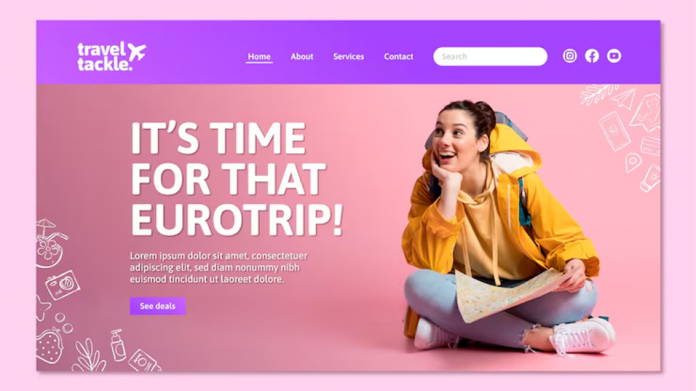
Getting people to visit your website or landing page is only half the battle. You can run paid ads, share links across social media, or write helpful content all day, but if visitors click away without taking action, your marketing effort goes to waste.
A high-converting landing page acts like a clear, welcoming signpost for your online business. It guides visitors directly toward a single goal—whether that means downloading a free resource, signing up for a newsletter, or purchasing a digital product.
Building a page that turns visitors into subscribers and customers does not require complex coding or expensive design teams. It comes down to clarity, focus, and understanding what your audience needs in the moment.
Here are five proven principles you can apply right away to turn your landing pages into reliable engine rooms for your business growth.
1. Focus on One Single Goal and Clear Value Proposition
The most common reason landing pages fail is simple: they offer too many choices. When you give a visitor five different links to click, two different offers to consider, and a navigation bar full of options, you create decision fatigue. A confused visitor almost always chooses to leave.
High-converting landing pages follow the principle of a single goal. Every element on the page—from the main headline to the background images—should serve a single purpose.
Eliminate Unnecessary Navigation Links
Unlike a traditional homepage, a dedicated landing page should not have a standard menu bar at the top. Remove links to your main blog, your about page, or social media profiles. You want your visitor to have only two choices: complete the desired action or close the tab.
Craft a Headline That Tells, Not Teases
Your main headline is the first thing people read. You have about three seconds to tell visitors what you are offering and why it matters to them. Avoid clever or vague phrases that force people to guess. Instead, speak directly to the benefit.
- Vague Headline: “Transform Your Digital Future Today”
- Clear Benefit Headline: “Learn How to Write Weekly Emails That Sell Your Digital Products in 30 Minutes”
When visitors instantly understand what they will gain, they stay long enough to read the rest of the page. If you are selling e-books, online templates, or courses, taking a strategic approach to how to build a landing page that converts for digital products helps ensure your message lines up with what buyers actually want.
2. Eliminate Friction at the Opt-In Point
Friction is anything that makes it hard or frustrating for a user to take action on your page. If your form asks for too much information, loads slowly, or looks confusing on a mobile phone, visitors will give up.
Ask Only for What You Need Right Now
Every extra field you add to an opt-in form lowers your conversion rate. If you are offering a free downloadable guide or inviting people to join your newsletter, you usually only need two pieces of information:
- First Name (so you can personalize future emails)
- Email Address
Save detailed questions like phone numbers, company size, or job titles for later in your customer journey. Keep the entry door as wide open as possible.
Optimize for Speed and Mobile Devices
More than half of your audience will view your landing page on a mobile phone. If your images are huge and take five seconds to load, visitors will leave before they read a single line.
Keep your design simple and layout clean so it loads fast on any device.
Fast Load Time + Short Opt-In Form = Lower Drop-off Rates
You do not even need a full, complex website to start capturing leads effectively. In fact, learning how to create a great landing page even if you don’t have a website yet is one of the fastest ways for new creators and solopreneurs to begin building an audience without technical setup hurdles.
3. Design for Visual Hierarchy and Persuasive Copywriting
People rarely read web pages word-for-word. Instead, they scan the page to see if it contains information relevant to them. Visual hierarchy means arranging your content so the human eye naturally flows to the most important elements first.
Use Formatting to Aid Scannability
Break up long paragraphs into digestible pieces. Use tools that make reading easy on any screen size:
- Subheadings (
##or###): Divide your page into clear sections so readers know what each part covers. - Bullet Points: Group related benefits together so key facts pop off the page.
- Bold Text: Highlight essential terms or key phrases to guide skimmers.
- Short Sentences: Keep your thoughts straightforward so readers do not get overwhelmed.
Position Your Call to Action (CTA) Prominently
Your Call to Action (CTA) button is the most critical button on the page. It should stand out visually from the rest of your design elements. Use a bold contrast color that draws attention right away.
In addition to color choice, pay attention to the text inside the button. Use action-oriented, personal language:
- Boring CTA: “Submit” or “Download”
- High-Converting CTA: “Send Me the Free Guide” or “Reserve My Spot Now”
To explore additional layout tweaks and button color choices that capture attention, review these 9 practical landing page tips for increased conversion alongside guidance on the best call to action colors to increase email marketing and landing page conversions. Small visual adjustments can make a noticeable difference in your overall signup rate.
4. Build Instant Trust with Real Social Proof
Online audiences can be cautious. Before visitors hand over their email addresses or credit card details, they want proof that you are real, trustworthy, and able to deliver on your promises.

Take Your Emails to the Next Level
MailDrip helps you automate your outreach, nurture leads, and grow your brand with ease. Send the right message at the right time—without the stress.
Sign Up FreeNo Card Required
Social proof works because people naturally look to others when making decisions. Showing that existing customers or subscribers enjoy your work lowers the perceived risk for new visitors.
“People do not buy products; they buy better versions of themselves and proof that others have successfully reached the goal first.”
Effective Types of Social Proof
You do not need thousands of reviews to build trust. A few honest, relatable pieces of feedback go a long way:
- Short Customer Testimonials: Brief quotes from people who used your resource or product to solve a real problem.
- User Counts: Simple statements like “Joined by 1,200+ independent creators” or “Over 500 copies downloaded.”
- Real Screenshots: Honest feedback from social media or email replies (with permission) often feels more authentic than formal reviews.
If you struggle to collect feedback from early buyers or subscribers, you can follow a clear framework on how to ask clients for a testimonial in 7 steps and build your social proof. Gathering genuine feedback helps establish credibility fast.
5. Connect Your Landing Page to Instant Email Automation
A landing page conversion is only the beginning of a conversation. What happens in the first few minutes after someone signs up determines whether that lead stays engaged or forgets who you are.
When a visitor fills out your form, they expect immediate feedback. They should be redirected to a clean thank-you page while receiving an automated email with their requested link or download straight to their inbox.
Build Automated Nurture Sequences
Do not let your new subscribers sit on a cold list. As soon as someone signs up through your landing page, an automated email sequence should welcome them, deliver value, and introduce your brand.
Landing Page Signup ➔ Instant Welcome Email ➔ Value Sequence ➔ Offer
Setting up automated lead nurturing helps you build trust automatically while you focus on running your business or creating new products.
How MailDrip Simplifies Landing Pages and Lead Generation
Building high-converting landing pages and connecting them to your email tools should not feel overwhelming. You do not need bloated enterprise software, complicated automation trees, or a marketing degree to grow your online business.
That is why we built MailDrip. Born in Yaba, Lagos, Nigeria, MailDrip was created by Charisol Limited with a clear mission: make email marketing and lead capture simple, affordable, and stress-free for creators, solopreneurs, digital marketers, and personal brands.
No Bloat + Simple Tools = Revenue Growth Without Friction
Here is how MailDrip helps you execute landing page and email strategies effortlessly:
- Built-in Landing Pages and Forms: You do not need a custom website to start building an audience. MailDrip gives you intuitive opt-in forms and landing page capabilities out of the box.
- Seamless Gmail Integration: Connect your existing personal or business Gmail account directly to your MailDrip dashboard. Safely send up to 500 daily emails with a personal account, or expand up to 2,000 emails per day with a business workspace—no complicated server settings required.
- Simple Drip Sequences: Create automated sequences that welcome new leads from your landing pages, deliver downloadable items, and turn casual subscribers into paying customers on autopilot.
- Pay Only for What You Need: Forget forced monthly fees if you are just starting out. MailDrip offers a Pay As You Go (PAYG) credit model alongside a free tier offering 1,000 emails and unlimited contacts.
- Real Human Support: If you ever run into a question, our team offers 24/7 support via chat, email, and WhatsApp. No robotic loops—just friendly help from real people who care about your growth.
Explore our straightforward MailDrip features or visit our main MailDrip homepage to see how simple email growth can be. You can check out our flexible pricing plans to find an option that matches your current business stage.
Frequently Asked Questions (FAQs)
What is considered a good conversion rate for a landing page?
While average landing page conversion rates vary by industry, a rate between 5% and 15% is generally considered solid across most niches. High-performing opt-in pages with very specific, valuable lead magnets can sometimes achieve conversion rates of 20% to 30% or higher.
Do I need a full website to use a landing page?
No, you do not need a full website. Standalone landing page tools allow you to host high-converting opt-in pages on custom links or platform-provided URLs. Tools like MailDrip provide simple forms and built-in landing pages so you can collect emails right away.
How long should my landing page copy be?
The length of your copy depends on what you are asking the reader to do. If you are offering a free resource (like a PDF guide or short checklist), keep the copy short and focused on immediate benefits. If you are selling a higher-priced digital course or consulting offer, you will need longer copy to answer common questions and build trust.
How many CTA buttons should I put on one landing page?
You can place multiple CTA buttons on a long page, but all buttons should lead to the exact same outcome. For short opt-in pages, one prominent sign-up section near the top and one near the bottom is usually ideal.
What should happen immediately after a visitor converts?
After a visitor completes your form, redirect them to a clear thank-you page that confirms their submission. Simultaneously, send an automated welcome email containing their promised download or access link.
Building Landing Pages That Drive Real Growth
Creating a landing page that consistently converts visitors into subscribers does not require guesswork. By focusing on a single offer, eliminating form friction, maintaining a clear visual hierarchy, showcasing real social proof, and connecting your page to automated email workflows, you set your business up for sustainable growth.
Take a look at your current landing page or your next planned offer. Which of these five strategic principles can you refine today to make taking action even easier for your audience?
If you are ready to build simple landing pages and run stress-free email automations that bring in revenue, explore our insights on the MailDrip blog, see how hosting events works with our webinar landing page guide, or sign up for a free MailDrip account today.